Every trader has experienced the “Eureka” moment: you load a new indicator onto a chart, look back at the last few months of data, and it seems to pick every top and bottom with supernatural precision. It looks like the ultimate money-printing machine.
However, once you run that same indicator through a systematic backtest—or worse, try to trade it live—the results are disastrous. The equity curve stays flat or trends downward, leaving you wondering how something that looks so good visually can perform so poorly in reality.
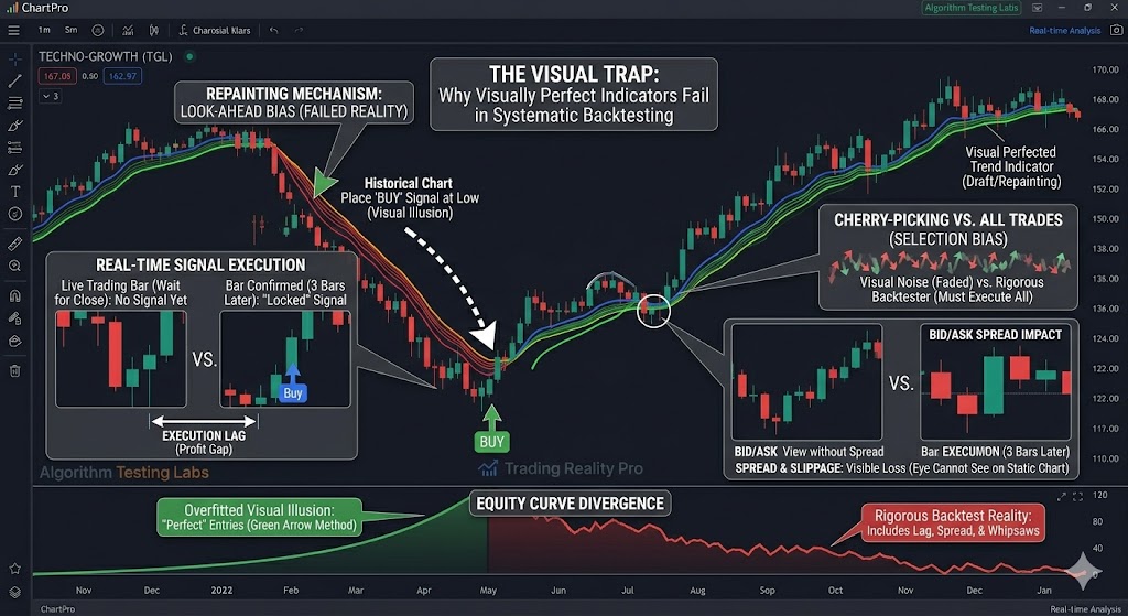
Here is why visual perfection is often a mirage in technical analysis and how to identify the structural flaws behind it.
1. The “Look-Ahead” Bias (Repainting)
The most common reason an indicator looks perfect visually is repainting. Many indicators “cheat” by using future data to calculate past values.
When you look at a historical chart, the indicator has already seen how the price action resolved. It places a “Buy” signal at the exact bottom because it only confirms that bottom after the price has moved significantly higher.
- The Visual: You see a signal at the lowest tick of the month.
- The Backtest Reality: The backtester realizes the signal didn’t actually appear until three days later, after the price had already rallied 5%. By then, the risk-to-reward ratio is ruined.
2. Selection Bias and the “Cherry-Picking” Effect
The human brain is a pattern-recognition machine designed to seek out success. When we scroll through a historical chart, our eyes naturally gravitate toward the “wins” while glossing over the “noise.”
- The Visual: You notice the three times the indicator caught a 200-pip move.
- The Backtest Reality: The backtester objectively records the 45 times the indicator triggered a signal that resulted in a 5-pip loss or a stopped-out trade. Those “small” losses, which are visually easy to ignore, eventually compound and wipe out the gains from the “big” wins.
3. Ignoring the Bid-Ask Spread and Slippage
A visual chart represents the “Mid” price or the “Last” price. It does not account for the friction of real-world trading.
Indicators that rely on small price movements or “scalping” logic often look incredible on a chart. However, in a backtest that includes spreads, commissions, and slippage, those winning trades often turn into break-even or losing trades. If your indicator targets a 10-tick profit but the spread is 2 ticks and commission is 1 tick, you are losing 30% of your edge before the trade even begins—something your eyes cannot see on a static chart.
4. Overfitting and Curve Fitting
If an indicator has too many parameters (e.g., “Length,” “Smoothness,” “Sensitivity,” “Multiplier”), it can be “curved-fitted” to a specific window of historical data.
- The Visual: The indicator is perfectly tuned to the volatility of the last 30 days.
- The Backtest Reality: As soon as the market regime shifts—moving from a high-volatility trend to a low-volatility range—the over-optimized settings fail. The indicator was essentially “memorizing” the past rather than “predicting” the future.
How to Verify an Indicator’s True Potential
To avoid falling for a visual trap, follow these three validation steps:
- Bar Replay Test: Use your platform’s “Bar Replay” tool. Watch the indicator calculate one bar at a time. If signals move, disappear, or appear late, it is repainting.
- Walk-Forward Analysis: Test the indicator on data it has never “seen” before (Out-of-Sample data). If the performance drops significantly compared to the visual “In-Sample” period, it is overfitted.
- Check the Execution Logic: Ensure your backtest executes at the Open of the next bar, not the Close of the signal bar. This small change often reveals the true “lag” that the human eye overlooks.
Conclusion
A visually stunning chart is the beginning of a research project, not the end of one. By maintaining a healthy skepticism of “perfect” signals and relying on rigorous, objective backtesting, you can filter out the illusions and find the tools that actually provide a sustainable edge.