The Three Stars in the South is an exceptionally rare, three-candle bullish reversal pattern that prints at the exhaustion point of a deep downtrend. Unlike highly explosive reversal setups, this pattern signifies a slow, grinding capitulation where the bears gradually lose the energy required to press prices lower. It represents a subtle, quiet transition from intense liquidation to passive institutional absorption.
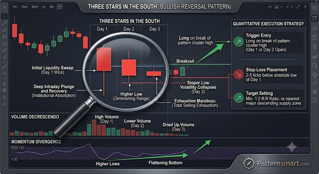
Anatomy of the Pattern
The pattern is identified by a very specific sequence of three bearish candles, each showing diminishing size and downward reach:
- Candle 1 (The Initial Drop): A large bearish candle with a long lower shadow, reminiscent of a hammer or a high-wave candle. This reflects a deep intraday plunge where buyers stepped in late to force a partial recovery, signaling that major support is nearby.
- Candle 2 (The Diminishing Range): Another bearish candle prints, but its overall range and real body are noticeably smaller than the first. Crucially, it opens higher and its low fails to breach the low of Candle 1, making a higher low. It also features a small lower shadow.
- Candle 3 (The Exhaustion Marubozu): The pattern concludes with a tiny bearish Marubozu (a small body with virtually no upper or lower wicks). This candle is completely engulfed by the range of Candle 2, sitting like a quiet period at the absolute end of the trend.
Market Psychology & Order Flow Dynamics
The underlying mechanics of the Three Stars in the South reveal a classic absorption campaign by large-scale market participants:
- The Initial Liquidity Sweep (Candle 1): Panic selling drives the asset sharply lower. However, institutional buy orders sitting at key structural levels absorb the supply, pulling the close well off the lows. This sets the definitive floor for the pattern.
- Loss of Downward Momentum (Candle 2): Sellers attempt to push the market lower again but fail to even match the previous day’s low. The shrinking candle body indicates that the supply available at these lower price tiers is rapidly drying up.
- Total Selling Exhaustion (Candle 3): The appearance of a tiny, wickless bearish candle is the ultimate sign of a dead trend. Volatility has collapsed entirely. The bears no longer have the inventory or momentum to push the market down, while the bulls are waiting for the perfect moment to step aggressively on the gas.
Quantitative Execution Strategy
Because the Three Stars in the South shows a market flattening out rather than launching violently upward, trading it requires patience and clear confirmation metrics.
Confirmation and Entry Rules
| Component | Tactical Action | Notes |
| Trigger Entry | Enter long on a confirmed breakout above the highest high of the 3-candle cluster (usually the open of Candle 2 or the high of Candle 1). | Avoid entering immediately at the close of Candle 3; the market is flat and can drift sideways. |
| Stop-Loss Placement | Placed 2–5 ticks below the absolute low of Candle 1. | This level represents the ultimate structural floor of the absorption zone. |
| Target Setting | Project a minimum profit target based on a 1:2 Risk-to-Reward ratio, or target the nearest major descending supply zone. | Because it takes time to build energy, the ensuing move is often a steady, sustained trend rather than a sharp squeeze. |
Maximizing Expectancy with Technical Confluence
- Volume Decrescendo: The volume profile should ideally mirror the candle bodies—vibrant and high on Candle 1, noticeably lower on Candle 2, and completely dry/below average on Candle 3. This confirms that the bearish trend is dying due to a lack of participation, rather than active distribution.
- Momentum Divergence: Look for this pattern to form while a standard 14-period Relative Strength Index (RSI) or Stochastic Oscillator shows a clear bullish divergence. While price is carving out a flattening bottom across the three candles, the oscillator should be turning up sharply from oversold territory ($<30$).
- Moving Average Compression: This pattern is highly effective when it prints right above a long-term moving average (like the 200-period SMA) on a daily chart, showing that macro institutional support is holding firm despite short-term bearish pressure.
Please check our Bullish Patterns Indicator collection.