True Center Band(TCB) is specially designed to work on intraday and daily chart.
- The top upper line(dark green) can be considered as overbought.
- The bottom lower line(Red line) can be considered as oversold.
- The overbought channel: between the 2 green lines.
- The center channel: between the 2 white lines.
- The oversold channel: between the 2 red lines.
- The upper buffer channel: between the light green line and the white line.
- The lower buffer channel: between the light red line and the white line.
To ride the wave, you must be able to detect the wave first. TCB is a perfect solution for you.
The center line shows the trend of the price for a given period, and the bands indicate possible price range within overbought and oversold areas.
Now, let’s see how to use TCB on Min charts.
The image below shows AUD/CAD in a 60min chart with TCB period=25.
Area (1) and (2) are not considered as good entry points, simply because the price may still go up from there.
However, area (3) and (4) are safer to enter, since prices at the overbought and oversold areas has higher chance to reverse.
By the way, it’s a head-shoulder pattern at (3) which is also a strong reversal signal.

The image below shows EUR/USD in a 60min chart with TCB period=20. The wave is clearly presented in front of you.
There is a W-top pattern right after the price cross above the overbought channel. It’s safe to short from there, but don’t forget your stop loss order.

You will see how TCB works in a downtrend as shown in the image below. 10-Year T-Note (ZN) futures in a 30min chart with TCB period=25.
The price will move between the center line and the bottom line, and the center line becomes a resistance before it breaks out.

The picture below is EUR/USD in a 60min chart with TCB period=20.
The highlighted area in the image below can be considered as a good entry point.

The picture below is also a 60min chart of EUR/USD with TCB period=50.
(1) is not ideal for long entry, because the price didn’t last long enough after it cross above the center channel.
But (2) is a better and safer area for long, given the price action is more stable after it marched into the center channel.

The picture below is also a 60min chart of EUR/USD with TCB period=20. The highlighted area in the image below is also a good entry point.
The price trend is almost the same as the previous two charts, the only difference is the date.
You can say that history repeats itself again.

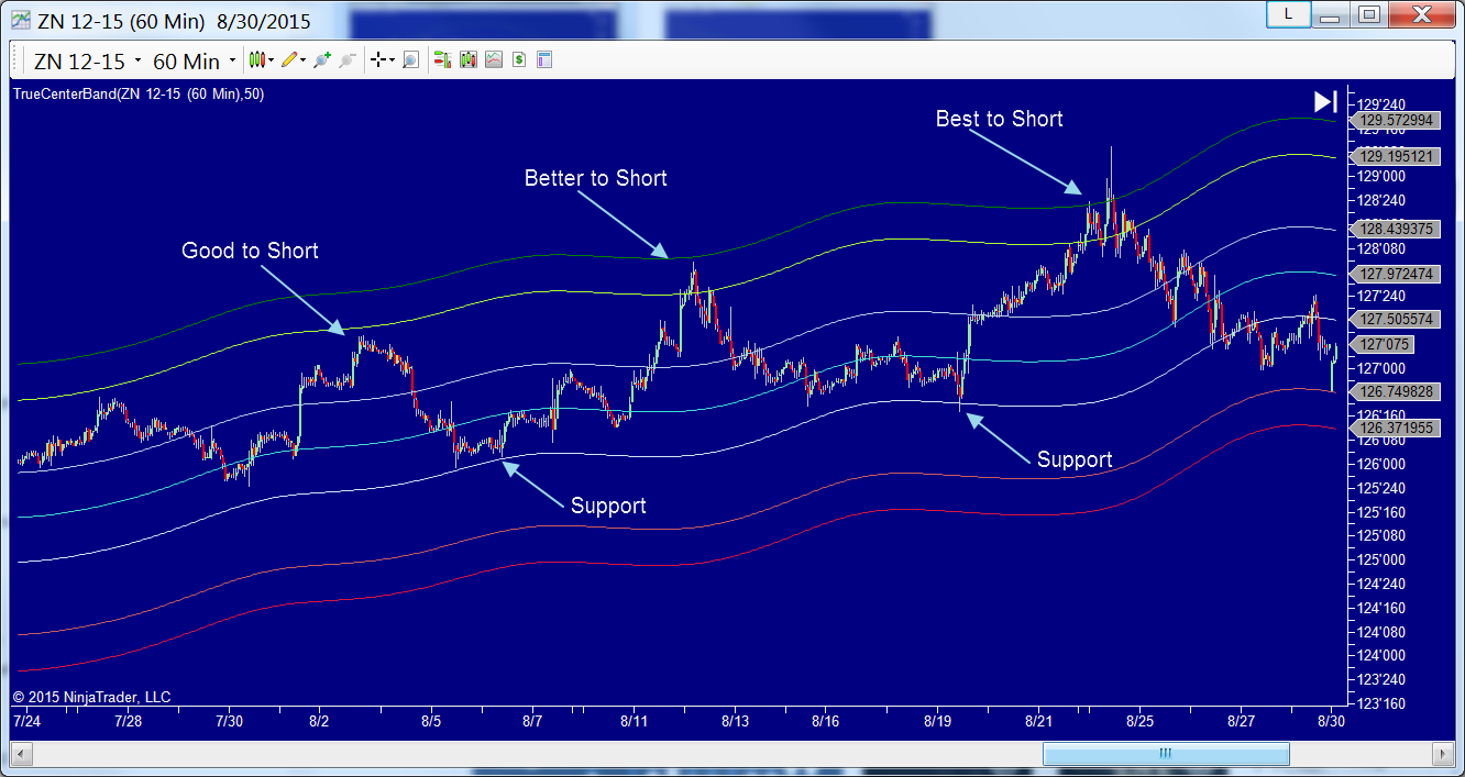
The picture below shows an uptrend of 10-Year T-Note (ZN 12-15) futures in a 60min chart with TCB period=50.
The 2nd peak is a better entry point to short than the first peak, because the chance for price to fall back after it crosses above upper buffer channel is relatively higher
And the 3rd peak is the best place to short in all 3 peaks. It is a perfect example of Elliott wave theory.
Without TCB indicator you can hardly tell where and when the Wave 5 ends. But with TCB, even inexperienced traders can easily confirm it.
(1) and (2) form a Rising Wedge pattern in the image below. Both orange (1) and (2) are in overbought channel, and at (3) the price cross below the pattern trend line.
The Rising Wedge pattern shows a weak rally, which, in most cases, will end up breaking through the lower line, TCB can be used to confirm the end of an uptrend.
It is a Symmetrical Triangle pattern at (4), this pattern can be both continuation and reversal. Since it happened at the oversold channel, a reversal is more likely to follow.

Take a look at the 4 hour chart of /TF 12-15.


In the chart below, the center band is the support when the price first attempted to break through it. And the center band becomes the resistance at (1) after the downward breakout.
If you decide to enter short at (1), it’s recommended to flatten your position when the price breaks through the oversold channel.

As you can see from the chart below, the price trend is U shaped, in the meanwhile the TCB is an arch.
It means the current price trend diverges from the accumulated trend within a given period of time.

The chart below is also a good example of divergence. In box (1) the price trend is an arch and the TCB is U shaped.
In box (2) it’s the opposite.

The following chart shows you how to catch the major trend reversals.
If we load a relatively long period of time to chart, such as loading more than 100 days on a 60 min chart.
We can easily notice that most of the major trend reversals are near the oversold and overbought channels.
The minor reversals at (1), (2) and (3) are harder to catch, since we can’t make sure if the price will continue the trend or not.
Compare to the minor reversals, TCB makes the major trend reversals easier to catch.

The following chart is another example of how TCB helped to confirm a chart pattern.

It’s always helpful if you recognize chart patterns.
A Channel Down pattern starts from the first overbought channel on the left side of the chart.
It followed by a Falling Wedge pattern at (1), just after the first time when the price hits oversold channel.
And the price breaks through the pattern trend line within the center channel and continue to go up until it reaches the top upper line at(2).

The price breaks through the support line of Ascending Triangle pattern which is also the center line, followed by a downward breakout.
