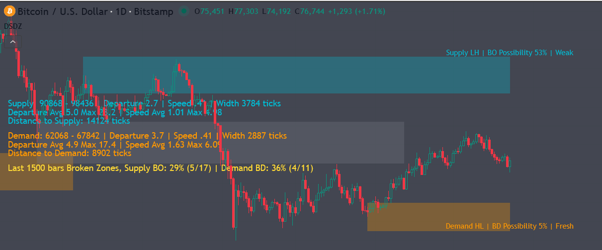
The dashboard provides a compact summary of the currently active Supply Zone and Demand Zone, including the zone price range, how strongly price moved away from the zone, how fast that move occurred, the zone width, the current distance from price, and recent broken-zone statistics. The indicator displays dashboard information when Show Dashboard is enabled, and it can also display broken-zone statistics when Use Validation Stats is enabled.
Supply Zone Information
Example display format:
Supply: 4350.25 – 4353.75 | Departure 1.8 | Speed 0.42 | Width 14 ticks
Supply Price Range
The Supply value shows the lower and upper boundaries of the active supply zone.
For example:
Supply: 4350.25 – 4353.75
This means the current supply zone is located between 4350.25 and 4353.75.
How to use it
Traders can use this range as a potential resistance or selling-pressure area. When price approaches the supply zone, traders may watch for rejection, slowing momentum, failed breakout attempts, or confirmation from their own trading method.
If price moves above the supply zone and holds above it, the zone may no longer act as resistance.
Demand Zone Information
Example display format:
Demand: 4298.50 – 4302.00 | Departure 2.1 | Speed 0.55 | Width 14 ticks
Demand Price Range
The Demand value shows the lower and upper boundaries of the active demand zone.
For example:
Demand: 4298.50 – 4302.00
This means the current demand zone is located between 4298.50 and 4302.00.
How to use it
Traders can use this range as a potential support or buying-interest area. When price approaches the demand zone, traders may watch for bounce attempts, rejection of lower prices, slowing downside momentum, or confirmation from other tools.
If price breaks below the demand zone and remains below it, the zone may no longer act as support.
Departure
Departure measures how strongly price moved away from the zone after the zone was formed. A larger value generally means price reacted more strongly from that area.
The dashboard displays this value for both supply and demand zones. The indicator shows that the dashboard includes Departure for the active supply and demand zones.
How to use it
A higher Departure value may suggest that the zone had a stronger previous reaction.
For a Supply Zone, a stronger departure means price previously moved downward more significantly after interacting with that area.
For a Demand Zone, a stronger departure means price previously moved upward more significantly after interacting with that area.
In practical use, traders may treat zones with stronger departure as more meaningful reaction areas, especially when they align with market structure, trend context, or higher-timeframe levels.
Speed
Speed measures how quickly price moved away from the zone. It helps describe whether the reaction from the zone was slow and gradual or fast and aggressive.
The dashboard displays Speed next to the Departure value for both active supply and demand zones.
How to use it
A higher Speed value suggests that price moved away from the zone more aggressively.
A fast move away from a supply zone may indicate stronger selling pressure.
A fast move away from a demand zone may indicate stronger buying pressure.
When Departure and Speed are both strong, the zone may represent a more significant reaction area. When both values are low, the zone may be weaker or less important.
Width
Width shows the size of the active zone in ticks.
For example:
Width 14 ticks
This means the distance between the upper and lower boundary of the zone is 14 ticks.
How to use it
A wider zone gives price more room to move inside the area before the zone is considered clearly broken.
A narrower zone is more precise but may be easier for price to pierce during normal volatility.
For trade planning, traders can use the width to understand how large the reaction area is. A very wide zone may require wider stops or more selective entries. A very narrow zone may provide cleaner levels but may also be more sensitive to market noise.
Departure Avg and Departure Max
Example display format:
Departure Avg 1.4 Max 3.2
Departure Avg
Departure Avg shows the average historical departure value from previously completed zones.
Departure Max
Departure Max shows the strongest historical departure value recorded from previous zones.
The indicator tracks finalized-zone statistics and records departure-related values when zones are broken or replaced.
How to use it
Compare the current Departure value with Departure Avg and Departure Max.
If the current departure is above average, the active zone may have produced a stronger-than-normal reaction.
If the current departure is near the historical max, it may indicate an unusually strong reaction.
If the current departure is below average, the zone may be less impressive compared with recent historical zones.
Speed Avg and Speed Max
Example display format:
Speed Avg 0.32 Max 0.85
Speed Avg
Speed Avg shows the average historical speed of price movement away from previously completed zones.
Speed Max
Speed Max shows the fastest historical move away from a previous zone.
How to use it
Compare the current Speed value against the historical average and maximum.
If current speed is above average, price reacted faster than usual from the zone.
If current speed is close to the maximum, the reaction was unusually aggressive.
If current speed is low, the zone reaction may have been weak or slow.
This can help traders judge whether the current zone is behaving like a strong historical zone or a weaker one.
Distance to Supply
Example display:
Distance to Supply: 36 ticks
This value shows how far the current price is from the active supply zone.
If price is below the supply zone, the dashboard displays the distance in ticks.
If price is already inside the supply zone, the dashboard displays:
Price is inside Supply
If price has moved above the supply zone, the dashboard displays:
Price is above Supply
These status messages are shown directly by the dashboard logic.
How to use it
Distance to Supply helps traders understand how close price is to a potential resistance area.
A large distance means price is still far from supply.
A small distance means price is approaching the supply zone and traders may start monitoring for reaction or breakout behavior.
If price is inside supply, traders may watch closely for rejection or breakout confirmation.
If price is above supply, the supply zone may have been challenged or invalidated depending on the trader’s confirmation rules.
Distance to Demand
Example display:
Distance to Demand: 42 ticks
This value shows how far the current price is from the active demand zone.
If price is above the demand zone, the dashboard displays the distance in ticks.
If price is already inside the demand zone, the dashboard displays:
Price is inside Demand
If price has moved below the demand zone, the dashboard displays:
Price is below Demand
The dashboard uses these demand-zone status messages to show whether price is above, inside, or below the active demand area.
How to use it
Distance to Demand helps traders understand how close price is to a potential support area.
A large distance means price is still far from demand.
A small distance means price is approaching a possible reaction area.
If price is inside demand, traders may watch for bounce attempts, absorption, or rejection of lower prices.
If price is below demand, the demand zone may have been challenged or invalidated depending on confirmation settings.
Broken Zone Stats
Example display:
Broken Zone Stats (500 bars) | Supply BO: 38% (5/13) | Demand BD: 31% (4/13)
This section summarizes how often recent zones were broken within the selected lookback window. The dashboard displays the lookback window in bars and separately reports Supply BO and Demand BD ratios.
Supply BO
Supply BO means Supply Breakout.
It shows how many recent supply zones were broken compared with the total number of supply zones counted in the lookback window.
Example:
Supply BO: 38% (5/13)
This means 5 out of 13 recent supply zones were broken, or 38%.
How to use it
A higher Supply BO percentage suggests that price has recently been breaking through supply zones more often.
This may indicate stronger bullish pressure, more frequent upside breakouts, or weaker resistance behavior.
A lower Supply BO percentage suggests that supply zones have been holding more often.
This may indicate that resistance areas are still meaningful and price has had more difficulty breaking above them.
Demand BD
Demand BD means Demand Breakdown.
It shows how many recent demand zones were broken compared with the total number of demand zones counted in the lookback window.
Example:
Demand BD: 31% (4/13)
This means 4 out of 13 recent demand zones were broken, or 31%.
How to use it
A higher Demand BD percentage suggests that price has recently been breaking below demand zones more often.
This may indicate stronger bearish pressure, weaker support behavior, or a market environment where demand zones are failing more frequently.
A lower Demand BD percentage suggests that demand zones have been holding more often.
This may indicate stronger support behavior or a market where buyers are defending demand areas more effectively.
How to Use the Dashboard in Trading
1. Identify the nearest active reaction areas
Use the Supply and Demand price ranges to quickly identify the current overhead resistance area and lower support area.
If price is between supply and demand, the dashboard helps you understand which zone is closer.
If price is approaching supply, focus on possible rejection or breakout behavior.
If price is approaching demand, focus on possible bounce or breakdown behavior.
2. Compare current zone quality against historical behavior
Use Departure, Speed, Departure Avg, Departure Max, Speed Avg, and Speed Max together.
A zone with above-average Departure and above-average Speed may represent a stronger reaction area.
A zone with low Departure and low Speed may be less reliable or less important.
This comparison helps traders avoid treating every zone equally.
3. Use distance values for timing
The Distance to Supply and Distance to Demand values help traders avoid reacting too early.
If price is still far away from a zone, the zone may not be immediately relevant.
If price is close to a zone, traders may prepare for possible reaction, rejection, breakout, or breakdown.
If price is inside a zone, traders may wait for confirmation instead of entering blindly.
4. Use broken-zone stats to understand market environment
The Supply BO and Demand BD values can help identify whether recent zones are holding or failing.
If Supply BO is high, upside breakouts through supply have been more common recently.
If Demand BD is high, downside breakdowns through demand have been more common recently.
If both values are low, zones may be holding better and the market may be more responsive to support/resistance areas.
If both values are high, the market may be more directional or volatile, and traders may need stronger confirmation.
5. Combine dashboard values with your own entry rules
The dashboard should not be treated as a standalone buy or sell signal. It is best used as a context tool.
For example:
A trader looking for a short setup may prefer price near supply, strong supply-zone history, reasonable distance, and signs of rejection.
A trader looking for a long setup may prefer price near demand, strong demand-zone history, reasonable distance, and signs of buying response.
A breakout trader may focus on high Supply BO or high Demand BD readings, especially when price is already pressing into a zone.
Suggested Short Customer-Facing Summary
The dashboard gives traders a quick overview of the active supply and demand zones, including their price range, width, distance from current price, reaction strength, reaction speed, and recent broken-zone statistics. These values help traders evaluate whether price is approaching a meaningful reaction area, whether the current zone has shown strong or weak behavior, and whether recent market conditions favor zones holding or breaking.