
cTrader
Divergence
Divergence Analysis
Forex
Indicator
Indicator Concepts
Market Analysis
Support and Resistance
TPR
USDJPY Momentum Double Divergence & TPR Confluence Analysis on cTrader: Macro Bearish Resumption Across Multi-Range Frameworks
1. Introduction & Key Takeaways In modern systematic trading, isolating true structural shifts from temporary market noise requires cross-timeframe structural…

Stochastics Double Divergence Analysis: EURUSD on cTrader
The EURUSD daily timeframe on the cTrader platform is currently exhibiting a highly complex and statistically significant series of Stochastics…

EURUSD Williams %R Double Divergence Analysis on cTrader: Navigating Multi-Range Structural Reversals
Intraday technical structures on major currency pairs frequently require an analysis of momentum shifts across multiple lookback windows to filter…

Auto trend line indicator and Market Analyzer with crossover alert for NinjaTrader 8
Auto trend line indicator and Market Analyzer with crossover alert for NinjaTrader 8 The indicator will automatically plot the upper…

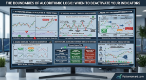
The difference between strategy and indicator in Ninjatrader
In institutional algorithmic trading and quantitative development, maintaining a strict separation of concerns between data analysis and order execution is…

Case Studies
cTrader
Divergence
Divergence Analysis
Forex
Indicator
Indicator Concepts
Technical analysis
EURUSD DMI Double Divergence Analysis on cTrader: Structural Bearish Continuity and Tactical Execution
This professional-grade technical analysis delivers an institutional-grade evaluation of the EURUSD currency pair utilizing an advanced quantitative setup on the…

XAUUSD ADX Double Divergence Analysis on cTrader: Macro Bearish Continuation Confirmed via Renko Structures
This technical analysis evaluates the structural order flow and momentum dynamics of XAUUSD utilizing advanced multi-timeframe Renko scaling. By isolating…
")
Money Flow Oscillator Double Divergence Analysis on NinjaTrader 8: Multi-Range Renko Structure Signals Bearish Exhaustion Micro Nasdaq (MNQ)
Comprehensive Technical Analysis of the Micro Nasdaq (MNQ) futures contract using the proprietary Money Flow Oscillator 2 Div Pro on…